


Click to enlarge.
Well, the two sides have been at odds for decades; tough to see them finding common ground now:
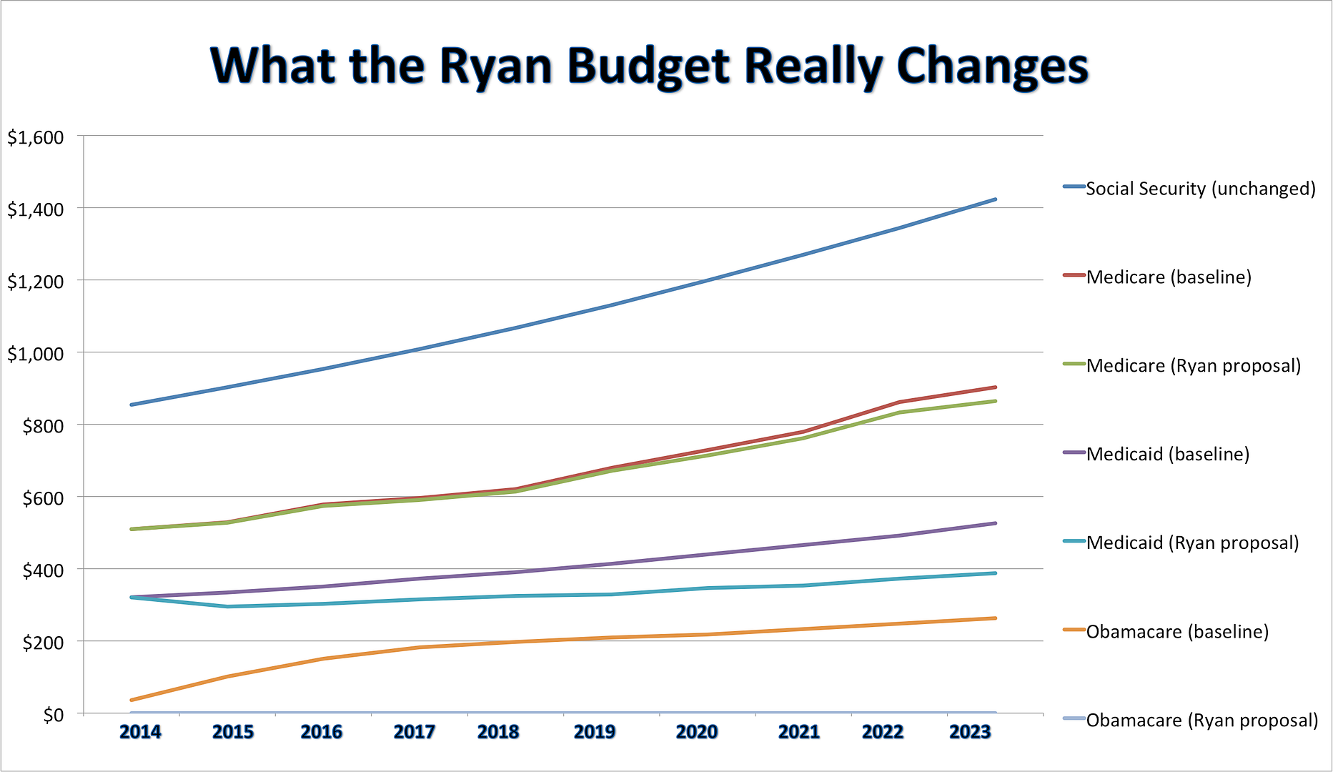
Last week when House Budget Committee Chairman Paul Ryan released his budget plan, the Washington Post tried to encapsulate the document in one single chart – “The Ryan Budget, in One Chart” – which shows the percentage change relative to the CBO baseline, illustrating a steep decline in “Medicaid/Other Health” spending. But does Rep. Paul Ryan’s budget really impose “draconian cuts?”
Go beyond the headlines and things look very different. The Independent Women’s Forum dug into the numbers to show a different perspective of what the Ryan Budget really looks like. IWF compared outlays in Social Security, Medicare, Medicaid and ObamaCare under current policy projections to those under the Ryan proposal. Under the Ryan budget, spending still rises in every category (except ObamaCare, which Ryan would keep flat at zero). Outlays are still going up, but in Washington, Democrats call these “draconian cuts.”
No wonder the Washington Post is so disappointed in itself these days.


Join the conversation as a VIP Member