


Editor’s Note: This supplement to Sarah Hoyt’s Selling Your Writing In 13 Weeks series first ran during January and February of 2014. Independent authors and self-publishing entrepreneurs should also check out Sarah and Charlie Martin’s weekly Book Plug Friday series where they can submit their books for inclusion.
Part 1: How to Judge Good Covers From Bad
Part 2: How to Create Your Covers Affordably
Part 3: The Tools You Need To Get Started
Part 4: A Step-By-Step Guide
Part 1: How to Judge Good Covers From Bad

Sometimes covers are supposed to create an impression
I’ve been meaning to do a post on covers, as a supplemental to my 13 weeks posts on selling your writing, but I couldn’t seem to do it, until I realized that I was in fact trying to cram several posts worth into a single post. Whenever I do that, I get highly bizarre comments, from people who read their own stuff into what I elided.
Part of this is a problem that I don’t remember what lay people know and don’t know anymore.
By lay people in this case, I mean people outside of publishing. Even avid readers might never have noticed consciously that covers are meant to signal genre, nor all the other subtle signals they give.
Before I start, I took the cover workshop with WMG publishing, and that made me aware of things even I hadn’t noticed, and I’ve been a professional in the field for several years. For anyone doing indie publishing, if you can afford the workshop take it. We’re right now scraping up the money to put older son through it. A I don’t use the same tools they do (I judged it was easier for me to use less professional tools than to spend a lot of time – more important than money – learning InDesign. So I use tools that I’m used to, the highly outdated but very familiar to me JASC paintshop. The newer versions, by Corel, which I own, aren’t nearly as good, but the last JASC version I can make sit up and sing, because I’ve been using it for ten years. And what it can’t do GIMP can. Both programs I’m familiar with and therefore find preferable to a program that I found oddly counterintuitive and would have to learn to use.) But even so, what I learned transferred. I won’t say it made me an awesome cover designer. That is an actual profession and you need years of practice and usually specialize in one genre. But it has made me a decent cover designer.
The other thing I should say is that every time I make one of these posts, I get people offering to design my covers. Most of these people have a background in art and design and usually some experience in tiny presses (or advertising layout.) All of the offers I’ve had, when I look at their samples, they’re very pretty… and all of them signal “literary and little” which is inappropriate for my books which are, unabashedly genre. Looking over the covers, I see myself at a con, passing the tables with books for tiny presses with names like Necrophiliac Duck Press. This is not the image I want to project, since my books were once published by big publishers, and I want the same feel for the re-issue. Also, I’m still publishing with one major publisher, and don’t want people to think everything I bring indie is “too precious for words.”
Some of it will be, but when it is, I shall so signal.
Fortunately for me, the big houses don’t usually give midlisters like me experienced cover designers. (I’m not talking of Baen here. They’re always an exception.) They usually hand the job to the first under-designer just hired from community college. And that level I can imitate.
However, to know where we are and what we’re doing, let’s start with a look at some bestseller covers in some distinct genres. And pointing out how they signal genre/subgenre.
This is something you should always do before you start designing covers. Go look at what other people are doing. Look at the bestsellers under paper (because that’s usually the professional books, that got lavish attention) and their covers, and figure out what to do for yours.
We’ll start with Romance, because it is the best paying genre, period.
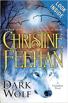
This seems to be a supernatural romance.
Note that this book is a “picture cover” with the hot male chest (the face is cut off. This is common in romance) and the wolf, which indicates to me “paranormal romance.” There’s usually an animal and a half naked man.
I’m not a font maven, so I can’t tell you what the font is, but it is a fancy font for the name, and the name is featured and about three times as large as the title. You can see that name even in thumbnail.
Yes, the author is a bestseller, but frankly, just seeing a name that size, without thinking, the reader will think “bestseller” so there’s no reason for you not to do it. It’s not a conscious thing, it’s beneath the thought process, so you’re not really lying. You’re just conveying the impression that you’re big heap writer and increasing the chances they’ll buy.

Note the “old time” hairstyle, (face again missing) and the font, as well as the author’s name in a golden shape. This is likely a regency (I don’t read much romance, but if the cover isn’t on a regency, they’re signaling wrong.)
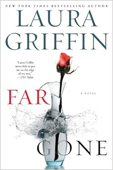
This is a contemporary romance/thriller. Note that it’s still a photo cover. The rose, and the shattering vase indicate romance and danger. Also, the romances with elements of thriller often have these spare minimalist covers. Again, note the author name on top.
Something I’m noticing looking through these, that even I never saw before, is that everyone says “a novel.” I don’t know if this is now in all fiction — an artifact of the digital age, where “a book” can be a novella or a short story — I shall keep an eye out as we move on.
Now let’s look at mystery. Mystery has a half dozen subgenres, but we’ll look at thriller, police procedurals and cozies. (You can look at the others yourself!)
![]() This is a thriller. Note the almost minimalist cover, with the letters center stage. That last romance cover could have worked well for a thriller with a romantic element, as well.
This is a thriller. Note the almost minimalist cover, with the letters center stage. That last romance cover could have worked well for a thriller with a romantic element, as well.
![]()
Police procedural — photo realistic art, stark lettering.
![]()
Cozy — a category that covers things like funny mysteries, Agatha-Christie like mysteries and craft mysteries. These always have “drawn covers” and often no people shown in any detail.
There are other subgenres, including historical. Go look them up. Look at how genre is signaled.
Then there’s science fiction and fantasy. Here you have to filter out the “movie based” (did that in the other sets to) because those tend to be different, and also the “first a bestseller in the seventies” because those covers often retain a touch of nostalgia, to fit with the author’s previous books.
You’ll also have to filter out paranormal romance, which Amazon throws in the same category, and Dean Koontz whose publishers have put him in Romance, Mystery and SF/F. Sigh. Publishers.
Clearly heroic fantasy. The character’s attire, the lettering, everything conveys “medieval” while the diffuse light in the back says “magic.”
![]()
This is urban fantasy, a genre that often skirts the edge of romance, but is not supposed to fall in. Note the tough chick and hints of monstrous being that are par for the course in this subgenre.
![]()
Historic fantasy is a genre now in eclipse, so there is no cover until like the third page, under fantasy. It runs the gamut, from just some kind of symbol on cover, to something evoking the time period. Note, it’s usually “drawn” not photo.
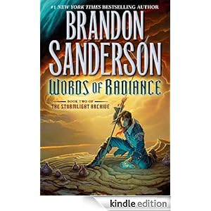
Science fiction has a million subgenres, but a lot of them are heavily influenced by Baen covers, which tend to be “a scene from the novel.”
Note for instance, Dave Weber, with Mil SF
![]()
Note the cover is “drawn, not a photo, again.”

This might not look it, but it’s also a drawn cover, and with the single figure, and stark lettering they’re going for the thumbnail clicks.
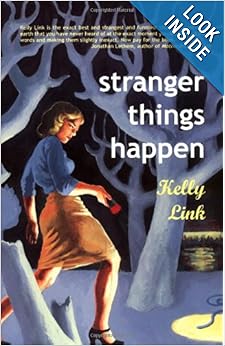
Then there is literary — oh, there are a ton of other things in between, but we should cover literary, before this post runs to ten pages.
Literary fiction often has the most beautiful covers, for sheer “oh, that’s artistic.” They also often have sketchy or very artistic lettering. They’re probably the hardest cover to do to convey “literary and important.” If you fall just slightly short you convey “literary and little” and while that’s a niche, it’s not… one that pays a lot.
![]()
Frankly this one is not very impressive, but the novelty of the peekaboo cover atones for some sins.
The problem here is filtering out all the novels that are “literary” in retrospect, though they were initially genre novels — like Farenheit 451 — as well as all the classicals and reprints.
But the next two are pretty good examples of “literary” and what you tend to get when you hire a decent cover designer for your genre book. (If you don’t hire a decent one, it can get much worse.) How worse? Look at last cover posted.
![]()

Note the nice pictures, the artistic, but not necessarily very legible lettering, and the tiny author name. If you’re writing for the Oprah recommendation, this is the way to go. (Of course you also need decent reviews, etc, but it doesn’t hurt to try.)
On the other hand, how bad can bad cover design get? Well, this gets linked all over. It’s still pretty awful anyway. So feast your eyes upon it:
![]()
Okay — so next we’ll look at how to make a book look like a book. I’m not an amazing designer, but even my evolution has been steep enough. (Though I as never as bad as the… thing above.)
****
Next: How to Create Your Covers Affordably
Part 2: How to Create Your Covers Affordably
There is nothing wrong with this cover, if — read the description — what you’re writing is somewhat “literary” (what the academics consider literary) a little highbrow, and appeals to a limited audience. It would, however, be a terrible cover for your bodice ripper, your sword and sorcery fantasy, your commercial urban fantasy, or anything else not “literary and little.” This is also how most cover designers you can get (i.e. not the ones working for major houses) design covers. And this is why it might be best to learn to do it yourself with resources at hand.
No, don’t run away (yet.) While my family has a tendency to go through the art museum making fun of things and pretending we think the trash can is an installation (it might have been, now that I think about it) and making all the arty people mad (well, guys, we pay our membership. We enjoy at as we want to. We’re not shouting. Stop getting close enough to us so you can seethe at what we say) that is not the sort of talk I want to have (though a stroll through the art museum with a camera followed by a “the Hoyts desecrate art post might be fun.)
I’m talking of art in its right and proper place and not exactly high art, either. (Yes, I know high art. During one of the worst depressions of my life, a book with reproductions of Leonardo DaVinci’s paintings and sketches pulled me through.)
The art we want to talk about here, is the sort of art that is needed in a certain place and needs to be good enough to pass muster in that place.
It’s sort of like the wallpaper patterns painted on canvas and mounted on cubes that are used on hotel walls. As “high art” they fall short of the mark, neither elevating nor communicating any other emotion. As art for your own home, they’d probably get incredibly tiring (unless you’re one of those people who uses his/her apartment as a crash pad.) But as “hotel art” it does break the monotony of what would otherwise be institutionally bland walls, and doesn’t have anything particularly memorable to offend or confuse a fussy guest.
The type of art we’re going to talk about is sort of the same: book cover art.
You must have something on the cover of your books. I’ve already talked about signaling and how to make sure your book fits with its genre. Most designers – and for that matter most artists – you can hire will in fact give you “art” and “cover design” that fits only with the “literary and little” set. This is because until very recently that was who the artists and cover designers who hadn’t quite made it worked.
The other problem with “hiring the professionals” is monetary. I’m now making around $500 a month from my indie (mostly backlog of reverted novels and short stories) publishing. But that is after two years and with my having a lot of backlog. Yes, it’s also on the low side due to these being reverted novels and my only having about a third of them out. I have friends who are making the same from one or two indie-published-from-the-get-go novels.

My art is okay, but not exactly cover quality. Not unless we’re going “literary and little” And besides, I’m out of practice.
But the thing is it’s a craps shoot. You might have ten novels out and only one of them sells regularly. Or you might put one novel out and it sells 20k in a month. I’ve known both extremes. I’ve also known novels that don’t sell for a year and suddenly sell 8k in a month, then returning to 100 or so a month after. This proves it has very little to do with quality (beyond basic readability) and everything to do with the novel being discovered (and no, there is as yet no reliable way to make your novel be discovered by the right audience. It will come. But not yet.)
What I’m trying to say, though, is that the indie publishing field is as yet too unstable and new for indie writers to go around paying hundreds of dollars for a cover (and that’s low. Professional artists get paid thousands) then hundreds for a cover designer, then hundreds for a book interior designer, after paying hundreds for an editor.
I know people whose first book out cost them 4k. Are they going to recover it? Who knows? If they’re lucky they might recover that in a month. If they’re not so lucky it could take two years.
I went through the Kris Rusch and Dean Wesley Smith workshops. What I took from them is that money flows to the writer. Yes, I do understand the need sometimes to hire out to do stuff, and I will have a list, later on, of people I know who do various services. BUT that is only justifiable if you’re already a going concern with a few stories out, and a baseline of what you’re likely to make, if your story is long enough you’re likely to sell a reasonable number (short stories sell less than novels) and if your life is so busy you can’t truly add another thing.
On that last – it might be worth it to you to pay to have stuff done instead of learning to do it, if your alternative is to stop writing while you learn to do it. But even so, you’ll want the best possible job for the lowest possible money, right?
Every time I come to this point, in a talk with a newby writer, I get hit with the same thing, “but I can’t draw. I can’t.” The stompy foot is optional.
This always makes me wonder if this person has ever looked for art on line. Because the alternative to “hire an artist to create a dedicated piece of art” is NOT “draw it yourself.”
My drawing, it is better than average, but the time for art classes has got squeezed out these last 4 years, and my skills have suffered. I can do sketches to show what I want, but they’re not “cover quality.”

This is the type of photo that might be perfectly okay as a cover, with a bit of manipulation by various programs. It’s from Morgue File, which means I don’t need to give credit, but why not do it? It’s by DodgertonSkillhause
You see, cover art can be bad, or very bad, but it has to look like a professional drew it. The worst cover I ever had (the hardcover art for Draw One In The Dark) looked like it was drawn by a 10 year old. Heck, my (then) ten year old could have done better. The problem with that cover was not the bad signaling (horror, instead of light fantasy) or the inexplicable stuff (a seashell around the guy’s neck) it was the fact that it looked like an elementary student had drawn it by tracing off an anime cover. (Yes, there are reasons. The publisher had just had a stroke. He then died. This happens. The book is being reissued in an omnibus with its sequel, under the title Night Shifters this summer.)
A lot of covers are confusing but look professional. And professional is not something you can do, not unless your other degree is art.
So, let’s talk seriously. I don’t expect you to draw your own covers. I expect you to buy them. But the covers I expect you to buy are not commissioned/dedicated and they will cost you – usually – well under $100. Some might even be free.
I’ll cover (ah!) what program I use (mine are as always heterodox but also cheap) and how to manipulate it to make it look good. In fact, I’ll start with one of my own early covers (as my friend Pam Uphoff said “the covers that were acceptable in early KDP are now very very bad.” So I have a lot of them needing redoing. And that’s the best way to show you how to do them.)
Here, I’ll just cover “Where to get art.” (And don’t fret too much if that art is photos and you need drawings. We’ll get to that. Promise.)
First, there’s several free sites for art. A lot of them are collected here.
I’ll confess I often routinely go through all of them and fail to find what I want, though. My go to sites for free art are EveryStockPhoto.Com (make sure you read the “about” on the picture. Some photographers forbid commercial use, some want you to write for permission and almost all insist on credit.) and Morguefile.com.
I’ll be honest with you, neither is much good for photos that require people and where the person will be identifiable. That’s because neither of them has a model release, which is something else you need to look for when looking for photos. But they’re both often quite good for animal or object or scene photos.

This was done with a $15 piece of stock art.
My next go to place, particularly when working on historical stuff, is ArtRenewal.com. If an artist has been dead since before 1927 (some later, but my lawyer has threatened to flay me alive if I use anything later than that, with a few exceptions) then you can use the art. (Note not the frame, though.)
For various reasons, including that if you use a painting in toto it gives the impression it’s a scholarly or classical reprint, it’s best to use a figure or a detail of the painting.
Under that heading and not exactly free, but cheap, I have an extensive collection of Dover Publications titles of old paintings. You know Great Victorian Fantasy Paintings, or what have you. I’m sure I haven’t (yet) used enough to justify what I paid for them, even at discount prices, but looking through them sometimes sparks an idea for something else.
But let’s imagine you’ve gone through all of those and not found anything you want. You’re doing a cover for a period romance, where the face of the model has to show, say, but it has to be a photograph, so old art won’t do. Or you want to do a specific fantasy setting and you’ve not been able to find the right look.
The answer is to go to one of the stock-for-pay places. I use dreamstime. I use dreamstime because it’s best for my piddly use. (I.e. I buy half a dozen photos a month or so.) As you know, PJM uses Shutterstock. My friend Kevin J. Anderson’s company – Wordfire – uses Shutterstock also, because he buys in batches of a hundred or so and the “monthly membership” comes out cheaper.
How much will art for a cover set you back? Well… the cover above cost me $15 for the maximum size, which means I can use it for print. Now, is it exclusive? Oh, heck no. In fact, I’ll have to get away from this artist, because they’re head and shoulders above all other designers, and so a lot of fantasy authors use the exact same cover.
(Yes, the cover design sucks and the lettering is so so – it’s a learning curve, okay? I am better now, but there are a lot more cryingly bad covers I have out there. This one will wait its turn.)
Now, if you go through all of that, and still don’t find what you want, you’re either going to have to change what you want (some of us have done it!) or you can cruise Deviant Art.
I have never got anything from Deviant Art. My requests for price or asking whether things are for sale go unanswered 9 times out of 10. The tenth time I get an indignant “it’s already sold.” That’s fine. That’s me. I have friends who’ve got art there, though. Be careful before you enquire, though, and run the art through a reverse image finder. I’ve found people posting as theirs public domain or – worse – someone else’s art. I don’t think this is exactly “on purpose” or to defraud, but very young artists who just want approval, but there it is.
Anyway, that’s where to find art. The rest we’ll leave for next time, including how to manipulate a photo so it looks like a drawing or painting.
****
Next: in Part 3 see the tools you need.
Part 3: The Tools You Need

Start with a cat picture taken from Morguefile, and take it to JASC paintshop and do one step photo correction? Could you use this as a cover? probably not. Most stories that would take a cat on the cover require drawings to signal right genre. This photo is by SimoneSantos btw.
Before we start this, I’d best come clean and explain that I never do things with standard programs or in the standard way. This is not on purpose. It’s because my brain seems to be wired backwards and sideways from every other human being on the planet and, if there are aliens, from every other alien too. No, seriously. Trying to follow along and do things the exact way I do them is probably a fool’s game.
For instance, for years after everyone was using Microsoft Word for writing, I continued using Corel Wordperfect. It did what I wanted it to, it was intuitive to me, and I had no intention of changing, much to the despair of my computer-geek husband.
I finally switched to Word only because most conversion programs for ebooks gag at Word Perfect. I’ve now been using Word for two years, and I’m used to it, and it doesn’t bother me anymore. BUT the ramp up and changing of my brain’s default settings took me about six months where I couldn’t just concentrate on the writing, because the mechanics of the program kept obtruding.
For me, at least – if not for any sane human being – this is often a reason to stick with outmoded software. I have very little time and don’t want to spend time retooling my workflow.
Most people doing their own covers use one of two programs: either Photoshop or the free alternative, GIMP. Me? Well….
I might be willing to give Photoshop a try, but I’ve seen people use it, and there would be significant retooling. I’m not willing to invest the time into that retooling. The fact that the company which makes Photoshop – Adobe – has gone subscription-only and that its website got hacked for subscriber data a few weeks back was just icing on the cake. I don’t see any reason to deal with that.

Run by Filter Forge Watercolor filter, a suitable image for “Cats I’ve known, a recollection of a life among felines.”
GIMP seems to be a fine program, but again there’s a ramp up – I’ve been playing with it in my copious spare time, but at the rate I get spare time, it’s going to take me a year before I’m fluent with it.
I’ll start by saying that for years now I’ve been using JASC Paintshop Pro9. Why that version? Because it was the last one in which Paintshop was a “poor man’s photoshop.” After that, it was bought by Corel which took it more in the direction of “program for scrapbookers.” Most of the features added are useless to me, the program is buggy, and some of the things I used aren’t really that functional any more. My husband – a computer geek’s hope springs eternal – keeps buying me the latest Paintshop, so we own it, but if I’m going to learn a completely different program, I’ll learn GIMP.
After taking the WGM Publishing covers workshop, I thought I’d have to learn Photoshop and InDesign, or at least GIMP. But I know my way around JASC Paintshop pro REALLY well, and by poking and prodding I found I could do everything needed with it – except save as PDF which is necessary if you’re going to make a paper version of your book. That’s what Createspace takes. So, now I process the image, save it as a photoshop file (which GIMP recognizes, and which saves all layers) and then take it over to GIMP, open it and export it as PDF. Voila. The advantage of my method if you’re just starting out is that JASC while you might have to bootstrap it in places is very simple and WYSIWYG compared to Photoshop. It is also, being over ten years old, ridiculously cheap, and GIMP is free.
Other things I use – I bought a package of 10000 fonts. These fonts are all free various places on the web, but I didn’t want to go looking for them one by one. This has them all in one neat, easily found place. (No, I didn’t install them all at the same time, but I can go digging through the folders when I need something special.) Not using photoshop handicaps you a little there, because photoshop comes with its proprietary fonts, which a lot of professional houses also use.
A word of caution here – fonts are copyrighteable and often copyrighted. Make sure you’re using something that’s free for your use and free for commercial use.

The ghost cat and other mystery stories. (Okay, I’d need to play with the background, but not that much.)

The Cat Wore Whiskers and other stories.
The other thing I use, which I found only recently, is Filter Forge. I got an advertisement from them back in December when they were having a firesale type of thing. At first I thought they were only a photoshop plug in, then I found they could actually be used as a stand alone program.
When my husband asked me why on Earth I’d spent money on this program, when surely GIMP filters did the same thing, I showed him. Lets just say my son, the graphics geek, went “Whoa! Can I play with it on your computer, now and then?”
Yeah, it’s that good. It’s also addictive. You’ll want to play with your photos and it and… Control yourself. This is work! (Oh, okay, fine, you can play a little.)
So, these are the tools I use.
In the next – and last – post, I’ll put it all together and show you how to do a cover from beginning to end. I’ll do it using my tools. You can feel free to use whatever you want.
I do recommend, however, that if you can, and if you have more than one cover to design (i.e. you’re a writer who has a lot of properties that have reverted or, alternately, you’ve got twenty short stories or novels under the bed which you’re not going to publish yourself by some means) you might do worse than to take the WGM Publishing cover workshop. Supposing you can afford it, it’s a tool that will last you forever, and better than spending the same amount each time for a cover design who might or might not know how to signal right for your subgenre. I get no kickback from these, but I am a great advocate of learning to do things right if you possibly can.
I know some of you won’t be able to afford them, but for those who are, it will save years of stumbling around in the dark.
And, as my friend pointed out – what was a good cover for the early Amazon KDP program is screamingly bad now. And your goal is to look professional. Yeah, I know, we all hear a lot about not judging a book by the cover, but the truth is everyone does. It might not be a matter of “is this a pretty cover” but “is this something that was professionally done enough that I want to bother downloading a sample” and “does this look like what I normally read?”
So, look at your resources and do the best you can with what you have.
At some point — three? — months ago I posted either here or on one of my other blogs about doing the cover for Death of A Musketeer. This was particularly difficult because for some reason you can’t find drawings of musketeers in the stock sites (not unless, you want girl musketeers, cat musketeers or anime musketeers. I just wanted a musketeer.) So I did the best I could and got the dead man from The End of The Game of Cards by Jean-Louis Ernest Meissonier. Since the painter died in 1891, his work is safely out of copyright. My problem is that I couldn’t use the whole painting, or it gave the impression I was reprinting one of the classical works out of Gutenberg and also that the work would be too dull for words, right? (No, trust me on this.)
So I did the best I could by sticking the figure against a sketchy woodcut background, got from Fromoldbooks.com. It worked after a fashion (I’ve had worse covers.) But I wasn’t exactly transported by it, partly because though my idea was innovative, it also made the book stick out as odd, and therefore gave it a certain air of “literary.” Okay, it’s a mystery with the musketeers as characters, but it is very much written for fun, not edification.
It looked like this:

This is an okay cover, but you can bet neither the figure nor the background were done on purpose for this book, right?
So, I wasn’t happy about it, but within the resources I had, it was the best I could do. It’s the cover that is up, still, as I’ve not had the time to upload the new one. HOWEVER when I got filter forge I had an idea. I got a photo from morgue file and I ran it through the aquarelle filter in Filter Forge, and then I ran the figure of the dead musketeer from Meissonier. Then I did some color manipulation in Paintshop. This is the result:

This, on the other hand, does look like a cover designed and painted for this book.
So, now I have to find the time to upload it, and do the other covers in the series to match. Meanwhile, in the next (and final) post we’ll take one of my short story covers that was “good enough for old KDP” and bootstrap it from free or cheap sites, to looking good enough for the current KDP.
Now, are my current covers perfect? Heck no. Cover designer is a profession, and I’ve barely started. However, most beginner and mid-list writers get assigned to someone who either is a beginner cover designer, or is still learning. And that level I can get to. And so can you. There are tweaks I need to do (that series title should be white not yellow, because of where it is) but given that it’s a cover “from found objects” — it looks professional enough.
****
Conclusion: Ready to get started? Sarah’s Step-By-Step Guide is up next
Part 4: A Step-By-Step Guide

This is the cover of my upcoming novel from Goldport Press. The novel is regency fantasy (alternate world.) The background painting is by John Atkinson Grimshaw, a painter who infuses his paintings with an eerie light. The dragon and the man in the foreground (originally a photograph) are both from dreamstime. Both man and dragon were run through Filter Forge’s oil-painting filter, then tweaked to fit in with the colors, etc.
Now, this is a cover that will work for today’s Amazon KDP and frankly, all online sites, and also for Create Space printing. (Yes, I need to tweak that tag line, and there’s too much white showing around the space under his arm, but that’s blendable.)
However, the standards weren’t always so high, and the covers I (and others) put up when KDP was young are borderline offensive to the eye now. Which probably explains why so few of my old stories that are up there sell.
So, we’ll take one — The Blood of Dreams — because I’ve never liked it, and also because I happened to see it the other day and find it offensive.
The Blood of Dreams is a vampire short story set in post-Soviet Russia. It was published in The Secret History of Vampires, where the conceit was you had to use and historic figure. (I was invited to contribute and had to come up with something.) The rights have reverted to me. So I put it out, I think over a year ago. And this is what the cover looks like:

Is this the most horrible cover I have out there? Not even close. And that’s me, and my covers were never the MOST horrible ones out there. (They were pretty close, though.) However, seriously, no one could mistake that for a professional cover, either. Let me count the ways:
It’s two photoshopped together (not convincingly) photos. The lettering work is Times New Roman, I think. It’s not even centered. And it doesn’t in any way signal genre.
In fact, if you considered this as a traditionally published book, you’d expect it to be “my experiences escaping the East in the eighties” or something.
So, let’s give this much abused story a new look, shall we?
So, first I go to Morguefile and let my fingers do the walking (if I can find something in morgue file I don’t need to pay for it. So I’d like to at least get the background in morgue file.) My first search term is Russia. I’m looking for something (like that background) identifiable as “Russian.”
This is the photo I decided on:

It’s by fmfm166 at morguefile.
While I’m running it by Filter Forge, I’m going to look for a photo of a woman. Last resort, I’ll go to Dreamstime.com but the problem is that this limits how much I can show you. (I.e. picture of a woman pre-manipulation is right out, and in fact, I shouldn’t show you anything but the finished cover. It’s a license thing.) Look, the story involves a woman and vampires, and Moscow and Lenin and Stalin. I could, I grant you, use a drawing of Lenin or Stalin, but a woman on the cover will sell better.
If I go to dreamstime I won’t be able to put the raw picture here, because dreamstime is a specific license, though. I will put the transformed picture of the background, and then the full cover. But meanwhile let me look other places.
Success. Wikimedia commons has a photo of a painting by Ferdinand Keller which, since he died in 1922 is fair game. It’s a highly dystopic looking painting, so perfect. (It is by the way, photographed by Hampel Auctions.)

Since the image is an oil and in a certain style, it restricts what I can do with the background, too.
So I ran the image through the Sketchy Painting filter on Filter Forge, looking for something with a yellow greenish background, kind of like the one behind the figure. Meanwhile, I’m figuring out how to give her two convincingly painted/matching neck wounds vampire style.
And now I wait on Filter Forge which on this detailed a render takes one or two centuries to finish.
Right, so this is what the painting looks like after going through Filter Forge:

The colors are far too pale for the background of that painting, so I brought it up in JASC paintshop and did some manual color adjustment. I also reduced the size of the picture, since I’m only making an ebook, and there’s no point having a massive image (besides lowing everything down.) So I brought it down to 1563×2500 pixels, the dimensions for an Amazon e cover.

Okay, so I do the next step and add the woman from the painting to the background (and mirror them both, since she’s supposed to be facing the right (book covers are supposed to, that’s how you think of a book opening, at least in English.))
 Note I’ve set two vampire marks on her neck. But it still doesn’t look right. I can’t push her to the left till her hand disappears because that gives the impression of “character being eaten by edge of book.”
So, I need something to replace the green copper dino lyre (until I looked at it on the page, it looked like a dino to me. need new glasses.) Um… Enter that old communist (and worse in this story) Comrade Vladimir Ilyich.

http://www.everystockphoto.com/photographer.php?photographer_id=22796
So, I downloaded this, and cut off the revolting pedestal, and am going to do stuff to it…
Okay, so I removed the lyre monstrosity and added the communist monstrosity. And put Lenin through the painter thingy.
 If you read the story, this cover is ALMOST too literal, but since I committed myself to using free elements so I could show you the progression, and since the woman in the painting was cuddling a metal lyre, something had to be done. At least now, she’s reacting to something and not being eaten by the edge of the page as when I tried to make her hand vanish. Which is, of course — always late — when an idea occurs to me. What if I bring her lower on the page, and make that entire arm vanish?
 Okay, just because it’s a horror story, we don’t need to have a monster on the cover — so I got rid of Lenin. I’m still not happy with the luminosity of the figure vs. background. I had to make her stand out (she was fading into it) but now it’s too contrasting. Um….
So, I played with the contrast, the transparency of the layers, and inserted a yellowish layer underneath, and I have this:
 If this were a novel cover, I’d probably play with it for a few more rounds, but it’s a short story, and it’s approaching the point where it REALLY won’t pay for my effort. So, I’m going to go to lettering.
I’m going to use Shrewsbury condensed because it’s by the way of being my house’s “historic” font. Though this is set in the nineties, it echoes back to the history of Soviet Russia, so… let’s try it.
Shrewsbury Condensed looks fine, and I added the other stuff (Tag, and “A short story” in Candara, so it doesn’t compete with the title and author name. Normally I put the title at the bottom, but here the color of her dress would interfere. After putting down the letters, I play a bit with the kerning, the idea being to bring the letters closer together but not touching, which takes some individual adjustments. Then I used 3d effects “inner chisel” and then I insert ‘drop shadow’ in a slight contrasting color.

And that’s the cover. Is it perfect? Oh, heck, no. Covers, like books, are never perfect. But — page to the beginning and tell me if it’s not a whole lot better. At least, it seems to do a better job of signaling “vampire” and “historical.” The “A short story” is something I learned to add, so that I don’t get awful reviews by people who don’t look at the page count and assume it’s a novel.
And that’s how I do a cover.
Am I setting up as an expert? Nope. I’m still a beginner — but I can make acceptable, if not extraordinary covers.If you want to learn for yourself, I recommend WGM Publishing Workshops. If you can’t afford it, I hope at least I’ve given you enough pointers that you can play with it and get better on your own. It’s not impossible. All it takes is a willingness to play with it and to keep trying out new ways of doing things.
*****
lead image illustration courtesy shutterstock / photo.ua


Join the conversation as a VIP Member