
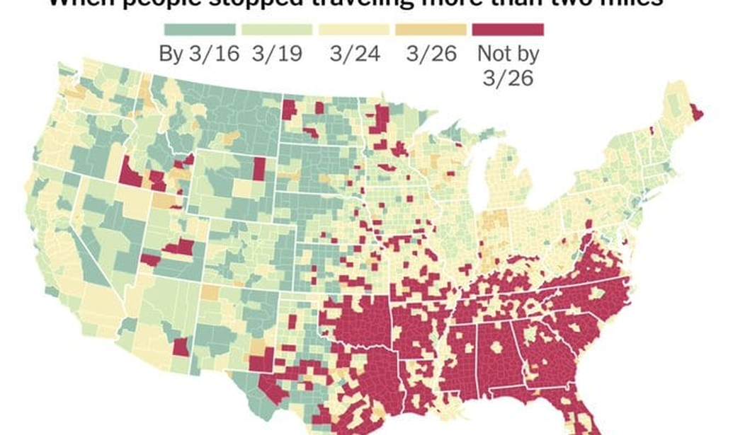
On Thursday, The New York Times published a story suggesting that the South is uniquely dangerous for the spread of the coronavirus. Michael Barbaro, host of the Times podcast “The Daily,” shared the map with the text, “In a word….The South.” Yet both the NYT article and Barbaro’s tweet ignored basic realities about American life that help explain the reasons behind the map — and show that the South is not a uniquely dangerous region during this crisis.
In the article, “Where America Didn’t Stay Home Even as the Virus Spread,” James Glanz dissects cellphone location data from the data intelligence firm Cuebiq. Cuebiq tracked 15 million people’s cellphone locations to map travel patterns across America. The resulting map does indeed suggest southerners continued to travel more than two miles even as states and local governments were issuing stay-at-home orders to slow the spread of coronavirus.

New York Times screenshot of coronavirus travel map.
“Disease experts who reviewed the results say those reductions in travel — to less than a mile a day, on average, from about five miles — may be enough to sharply curb the spread of the coronavirus in those regions, at least for now,” Glanz reports. Yet he admits the data “cannot predict where outbreaks will spread, and it does not track how many interactions people had while they were traveling. Not all travel is problematic: A person driving for a few miles to pick up groceries would not be violating stay-at-home orders. And people in cities can infect others without traveling far.”
Even so, Glanz cites researchers who supposedly faulted the South for supposedly enabling the spread of the virus more than other regions. “But broadly higher levels of travel suggest more contact with others and more chances to spread or contract the disease, researchers said. Counties with lax travel policies risk not only becoming the next hot spots of the disease, but also acting as reservoirs for the virus that reignite infection in places that have tamped it down, they said.”
Barbaro shared the map with the brief message, “In a word….The South.”

Twitter screenshot.
Barbaro admitted that his tweet was “not well-enough contextualized,” so he deleted it. However, he still shared the map and the article, which suggests the distances traveled by southerners makes the region uniquely susceptible to the coronavirus.
A lot of misinterpretation of my (not well-enough contextualized) tweet on this so taking it down.
Will let the map speak for itself, with link to article for greater context:https://t.co/Ak78wdp2um pic.twitter.com/ZsHLyPaJlh— Michael Barbaro (@mikiebarb) April 2, 2020
Others explicitly interpreted the map as dangerous for the South.
Raffi Khatchadourian, a staff writer for The New Yorker, suggested the map depicts America’s “lack of a national unified response” to the virus.
A striking visual in the New York Times today depicting what a lack of a national unified response looks like. pic.twitter.com/ofxrgSS3GA
— Raffi Khatchadourian (@raffiwriter) April 2, 2020
Aaron E. Carroll, a pediatrician and New York Times columnist, also claimed the map “bodes really poorly for the South.”
This bodes really poorly for the South. https://t.co/B570A7mdwL pic.twitter.com/CxWkCAenZl
— Aaron E. Carroll (@aaronecarroll) April 2, 2020
Jamelle Bouie, another New York Times columnist, took the opportunity to dunk on the Republican leadership in the South. “listen, if your take about poor statewide political leadership in the South doesn’t attempt to explain how a politically and demographically diverse region of the country is dominated by MAGA leadership, then it is a bad take,” he tweeted, slamming Gov. Ron DeSantis (R-Fla.) as a “corrupt incompetent” and accusing Florida of having “disenfranchised” much of its black population.
listen, if your take about poor statewide political leadership in the South doesn’t attempt to explain how a politically and demographically diverse region of the country is dominated by MAGA leadership, then it is a bad take
— b-boy bouiebaisse (@jbouie) April 2, 2020
The New York Times‘s Paul Krugman linked to an article about the high rates of obesity and diabetes in the South and warned that while “New York has been the epicenter of the crisis,” that fact “may soon change.” Then he added, “Guess where people haven’t been practicing social distancing?”
Guess where people haven't been practicing social distancing? 2/ https://t.co/cSxSNh4kNr
— Paul Krugman (@paulkrugman) April 2, 2020
Contrary to Krugman, the map and the data do not suggest that the South isn’t engaging in social distancing. Sure, many Americans in many parts of the country are not abiding by the social distancing guidelines — and that undoubtedly includes southerners. But the map only traces travel of more than two miles.
Nate Madden, press secretary for the House Republican Committee on Oversight, explained why. “I grew up in a cattle farm in one of those red counties. When I was a kid, the closest grocery store was 5 miles away. Now the closest to the farm is 4 miles away,” he tweeted.
I grew up in a cattle farm in one of those red counties. When I was a kid, the closest grocery store was 5 miles away.
Now the closest to the farm is 4 miles away.
— Nate Madden (@NateOnTheHill) April 2, 2020
Sarah Kendzior, an anti-Trump journalist and co-host of the podcast “Gaslit Nation,” juxtaposed the New York Times map with a map showing regions of the country where many people lack a car and a nearby supermarket.
“People are driving to get food and supplies and the stores are more than two miles away from where they live. I’m curious how ‘two miles’ was chosen by NYT as the standard for their map, which is being used to demonize people,” she tweeted.
People are driving to get food and supplies and the stores are more than two miles away from where they live. I'm curious how "two miles" was chosen by NYT as the standard for their map, which is being used to demonize people.
— Sarah Kendzior (@sarahkendzior) April 2, 2020
The Alabama Democratic Party cast shade on The New York Times with a tweet directly attacking Barbaro’s tweet. “If you’re RT’ing a map to dunk on ‘the South,'” the party began, “1. The South is two words not *a* word. 2. Don’t try to dunk on folks during a pandemic. Your mama taught you better. 3. That map won’t show you years of underlying policy choices. 4. We‘re working for a better South. How bout you?”
If you’re RT’ing a map to dunk on “the South”🗣
1. The South is two words not *a* word.
2. Don’t try to dunk on folks during a pandemic. Your mama taught you better.
3. That map won’t show you years of underlying policy choices.
4. We‘re working for a better South. How bout you?— Alabama Democrats (@aldemocrats) April 2, 2020
Coronavirus is spreading in the South, but even southern hot spots like Florida (7,773 cases) and Louisiana (6,424 cases) lag behind states like New York (84,046 cases), New Jersey (22,255 cases), Michigan (9,315 cases) and California (9,907 cases), according to Johns Hopkins University data reported on Thursday morning. Most of the areas highlighted on the New York Times map are rural, while the outbreaks in the South have been focused in urban areas such as Miami and New Orleans.

ABC News visualization of Johns Hopkins data.
None of this is to minimize the threat of the coronavirus in the South. Data reported by The Atlantic suggests that southerners are at greater risk of dying from COVID-19 at younger ages.
The very real threat the coronavirus pandemic poses to the South does not excuse The New York Times‘s misleading map, however. At the very least, Glanz needs to update his article to include an explanation as to why southerners may travel further than people in other parts of the country. As Kendzior pointed out, the Times map seems engineered to make the South look worse than it is.
Tyler O’Neil is the author of Making Hate Pay: The Corruption of the Southern Poverty Law Center. Follow him on Twitter at @Tyler2ONeil.


Join the conversation as a VIP Member