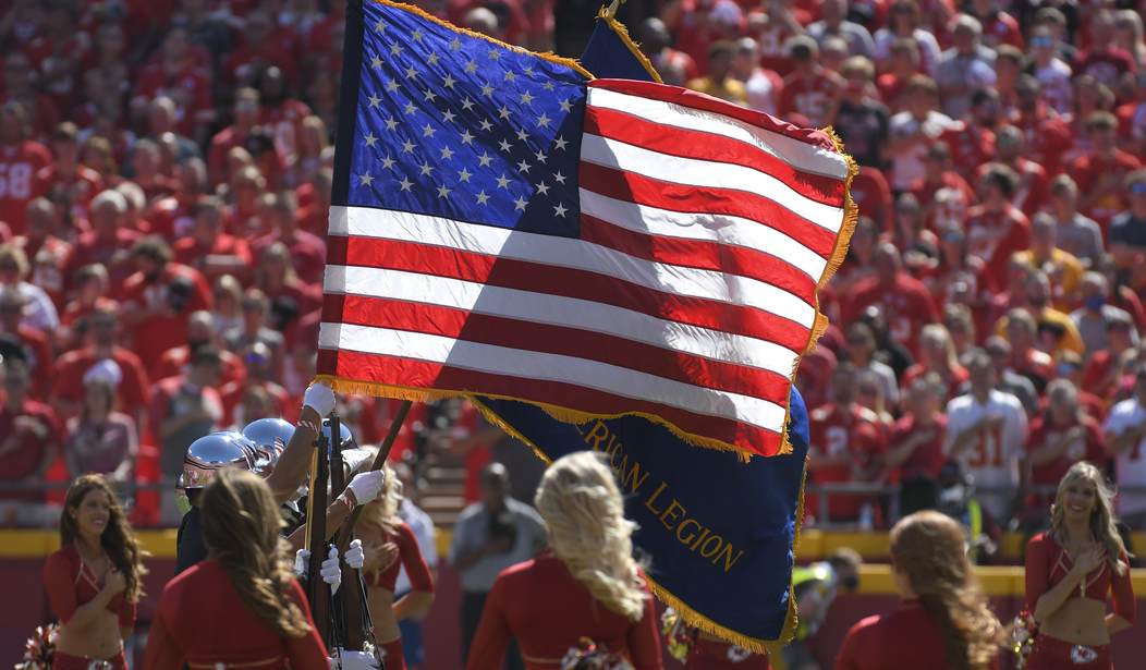
Earlier this month, we learned that a teacher in California removed the American flag from her classroom because it made her feel “uncomfortable.” She suggested her students recite the pledge to the rainbow gay pride flag instead. It seems like we’re constantly hearing stories about liberal snowflakes triggered by the American flag
Naturally, the New York Times decided to invite six artists to participate in an exercise to redesign the American flag.
“The American flag is a potent piece of national iconography, but its design shifted frequently until the early 1900s. What if it were redesigned today?” the New York Times wrote. “We asked artists and graphic designers to try. The flags they came up with reflect a mix of approaches. Some are functional designs, others artistic renderings; some represent America as it could be, others how the artist sees the country now.”
And they are all horrible. Apparently, they couldn’t find any artists with talent or love of country.
— Matt Margolis (@mattmargolis) September 29, 2021
One design, by artist Andrew Kuo, is basically a banner of leftist virtue signaling, including colors he says represent “repairing system racism” and “taking care of our planet.”
“I’ve designed a flag that acknowledges the emotions that informed where our country has been and the spirit of where it may go, with joy and forgiveness as possibilities,” Kuo says. “We can’t ignore how we got here, but maybe we can move toward a different, even better place.”
A flag designed by Natasha Jen, Michelle Ando and Veronica Höglund of Pentagram Design features the stars and stripes all woven together into an ugly pattern. “This flag is intended to suggest interdependency and togetherness,” the team explains. “The two elements are interwoven to create a ‘fabric.’ Interweaving suggests that we depend on one another and that as a whole, America is a fabric, held together by equality.”
Another design, from 2×4, blurs the existing flag into an ambiguous gradient.
Designer Na Kim designed a gray flag with white stars. “The colors of our flag are intended to stand for unity, valor and justice,” explains Kim. “The gray, monochrome flag represents America surrendering to its fall from power and loss of the ideals it once stood for. The American dream is being washed away.”
Can you hear me groaning?
FLASHBACK: CNN Asked for Redesigns of the Mississippi State Flag… and They’re All ‘Meh’
The most offensive flag visually, however, is by artist Hank Willis Thomas, who cuts up various flags, including the Black Lives Matter flag, the Gadsden flag, the Trump flag, the gay pride flag, and others into triangular pieces, creating one huge mess.
The next flag is an animation that makes no sense.
The final flag, by Joseph Han, Tom Elia, and J.A. Ginsburg of Collins, features six white stripes with three blue stripes, three red stripes, and one purple stripe. “The American flag was once a unifying symbol; its red, white and blue belonged to everyone. But now, red and blue are tribal signals, and the flag seems to represent two factions forced to share a piece of fabric,” the team explains. “By running a single purple bar across the middle, this flag reminds all of us of the constant potential and possibility inherent in America when red and blue come together as one.”
Whatever the intent of the design, it feels more like a representation of the partisan divide in this country, with red representing the political right, blue representing the political left, and purple representing the center.
Couldn’t the New York Times have found just one artist who actually loves the country and doesn’t see it as a symbol of evil to have designed something positive, maybe even somewhat decent?


