It’s been less than a month since the Climategate files were first disclosed, but they’ve already had a dramatic impact on the debate over climate change.
On the one hand is the dominant so-called consensus — that human emission of greenhouse gases has been the primary cause of an unprecedented warming of Earth’s climate. On the other hand, there has been an underground opposition trying to make itself heard. What the disclosure of the files did was demonstrate that these opposition voices had been suppressed unfairly and unscientifically.
As a result, the raw data that had been withheld is becoming available to outside researchers. This new openness is already having results.
Steve McIntyre of Climate Audit has done a careful analysis of the Climategate emails that affect one particular issue — the “tricks” that were applied to the data in composing the various reports. The particular issue McIntyre is considering is called “the divergence problem.” When we measure temperatures now, of course, we use a thermometer. For historical temperatures, however, reliable thermometers weren’t available until about 1724, with Fahrenheit’s mercury thermometer. And regular records of temperature weren’t done until some years later. (Thomas Jefferson was one of the first people to make regular temperature records.)
To make any kind of estimate of temperatures into the past earlier than about 1850, researchers need to use something that they believe is related to temperature — a proxy.
A common proxy is the size of tree rings in trees that were growing over the appropriate times. Keith Briffa had reconstructed a long series of temperatures using a tree ring proxy, but that record had its own issue. As it got closer to current times, where there were reliable temperature records, it diverged — it drifted away from the actual temperature measurements.
[There] is pressure to present a nice tidy story as regards “apparent unprecedented warming in a thousand years or more in the proxy data.” (Briffa to Pollen, Jones, and Mann)
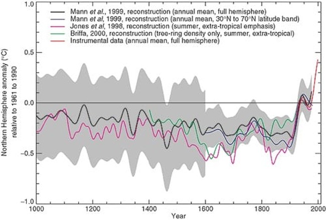
McIntyre argues this “pressure” resulted in this final figure appearing in the IPCC Third Assessment Report:
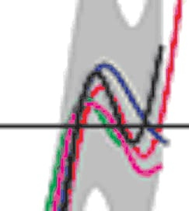
This figure shows the famous “hockey stick” — a sudden increase in temperatures starting after 1900. What McIntyre had already observed was that this figure had a peculiar feature — the Briffa reconstruction line (green) stopped rather suddenly:
The green line “gets lost” around 1960 and never reappears. McIntyre noticed this in 2005, and raised the issue in a comment on a later IPCC report. His comment was rejected.
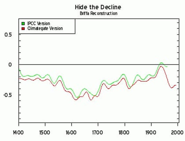
With the Climategate data, however, McIntyre was able to reconstruct the complete Briffa series, which turns out to look like this:
The green line is the version we saw above as part of the IPCC report, and the red line is the full series — which goes down rather dramatically, instead of up as the story suggested. If the full Briffa series had been included, the figure would look rather different. The hook upward, the blade of the hockey stick, would have been much less dramatic, the implied global warming much less significant. By truncating the data as they did, the global warming looks much worse.
And as the Climategate emails show, this was the result of a long discussion of how to best deal with “pressure to present a nice tidy story.” A story that fit the IPCC’s political goals, whether it suited the science or not.


Join the conversation as a VIP Member