

[jwplayer config=”pjmedia_eddriscoll” mediaid=”66342″]
 You may know graphic designer Michael Bierut from the above scene in the 2007 documentary Helvetica, which explored how a mid-century European font became the face of corporatist America, private enterprise yoked increasingly under the command of government. Or as I dubbed it back in 2010, after watching the film on a flight back from New York, “Liberal Fascism: The Font.” As I wrote back then, Bierut’s statement in the above clip is a dual-edged sword. Yes, there was a revolution in graphic design in the 1960s. The problem, as Bierut tacitly announces above, is that everything looked the same afterwards, just as the influence of the Weimar-era socialist Bauhaus made every skyscraper in America looked like “socialist worker housing pitched high,” to borrow from Tom Wolfe’s lingo in From Bauhaus to Our House. In the 1950s, every behemoth corporation in America dumped their original offices for Mies van der Rohe-inspired buildings; in terms of graphic design, every behemoth corporation the following decade dumped their individual graphic design, often built up over decades, for a Saul Bass-style corporate logo and their name spelled out in Helvetica. As Frank Burns, the token conservative and — not coincidentally — locus of hate on TV’s M*A*S*H once said, in a quote that would come to define the M.O. of the modern left, “Individuality is fine, as long as we all do it together.”
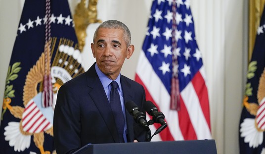
Deep down, Barack Obama would absolutely agree with Frank’s comment; as his former secretary of state infamously said, “We’re going to take things away from you for the common good.” In the late 1990s, when asked about a possible tax cut, her husband, then president, looked at the surplus generated by the Republican Congress and commented, well, we could give you the money back, but you might spend it on the wrong things. And at the 2012 Democrat convention, aka, Obama’s second coronation, the narrator on the video famously said, “Government is the only thing that we all belong to.”
But back to Bierut. Here’s a telling observation from Rich Lowry of National Review, who notes that “Obama Loses His Cool,” or as the blurb on the NRO homepage linking to it adds, “Only the trouser crease remains:”
Barack Obama is the coolest president we’ve had since John F. Kennedy, at least according to conventional standards for such things. Obama has always been a brand as much as a politician, one that has been perceived as sleek, smart, and up to date.
Then along came HealthCare.gov. Its failure to launch is a signal event in the long political battle over Obamacare and perhaps an inflection point in the president’s image. It’s hard to maintain a sense of truly being on the cutting edge of change when you can’t build a website.
Obama’s cool was, in part, an artifact of world-class marketing. Graphic designer Michael Bierut writes in the book Designing Obama (yes, there’s such a book) of how impressed he was watching Obama rallies in 2008: “The awe-inspiring part was the way all the signs were faithfully, and beautifully, set in Hoefler & Frere-Jones’s typeface Gotham.” If only the folks at Health and Human Services were consumed with such attention to detail.
But that’s just it — the graphic design of the Website looks fine; the “vaguely ethnic smiling woman,” on its homepage, as Viacom’s Stephen Colbert dubbed her, was a fine choice as the site’s first icon. It’s what’s going on behind the scenes that counts. And from all accounts, while its fonts are perfect, the actual back-end coding is a mess — it crashed today in front of legendary Internet maestro Kathleen Sebelius with reporters and video cameras present, leading Glenn Reynolds to Insta-quip, “Have we reached ‘peak schadenfreude’ yet?”
This latest news of fresh disaster brings us to Fouad Ajami’s pitch-perfect final paragraph at Real Clear Politics:
Valerie Jarrett, the president’s most trusted, probably most powerful, aide, once said in admiration that Mr. Obama has been bored his whole life. The implication was that he is above things, a man alone, and anointed. Perhaps this moment—a presidency coming apart, the incompetent social engineering of an entire health-care system—will now claim Mr. Obama’s attention.
Beyond the fonts and logos, of course.


Join the conversation as a VIP Member