

Sometimes covers are supposed to create an impression
A supplemental series to Selling Your Writing in 13 weeks. Post 1.
I’ve been meaning to do a post on covers, as a supplemental to my 13 weeks posts on selling your writing, but I couldn’t seem to do it, until I realized that I was in fact trying to cram several posts worth into a single post. Whenever I do that, I get highly bizarre comments, from people who read their own stuff into what I elided.
Part of this is a problem that I don’t remember what lay people know and don’t know anymore.
By lay people in this case, I mean people outside of publishing. Even avid readers might never have noticed consciously that covers are meant to signal genre, nor all the other subtle signals they give.
Before I start, I took the cover workshop with WMG publishing, and that made me aware of things even I hadn’t noticed, and I’ve been a professional in the field for several years. For anyone doing indie publishing, if you can afford the workshop take it. We’re right now scraping up the money to put older son through it. A I don’t use the same tools they do (I judged it was easier for me to use less professional tools than to spend a lot of time – more important than money – learning InDesign. So I use tools that I’m used to, the highly outdated but very familiar to me JASC paintshop. The newer versions, by Corel, which I own, aren’t nearly as good, but the last JASC version I can make sit up and sing, because I’ve been using it for ten years. And what it can’t do GIMP can. Both programs I’m familiar with and therefore find preferable to a program that I found oddly counterintuitive and would have to learn to use.) But even so, what I learned transferred. I won’t say it made me an awesome cover designer. That is an actual profession and you need years of practice and usually specialize in one genre. But it has made me a decent cover designer.
The other thing I should say is that every time I make one of these posts, I get people offering to design my covers. Most of these people have a background in art and design and usually some experience in tiny presses (or advertising layout.) All of the offers I’ve had, when I look at their samples, they’re very pretty… and all of them signal “literary and little” which is inappropriate for my books which are, unabashedly genre. Looking over the covers, I see myself at a con, passing the tables with books for tiny presses with names like Necrophiliac Duck Press. This is not the image I want to project, since my books were once published by big publishers, and I want the same feel for the re-issue. Also, I’m still publishing with one major publisher, and don’t want people to think everything I bring indie is “too precious for words.”
Some of it will be, but when it is, I shall so signal.
Fortunately for me, the big houses don’t usually give midlisters like me experienced cover designers. (I’m not talking of Baen here. They’re always an exception.) They usually hand the job to the first under-designer just hired from community college. And that level I can imitate.
However, to know where we are and what we’re doing, let’s start with a look at some bestseller covers in some distinct genres. And pointing out how they signal genre/subgenre.
This is something you should always do before you start designing covers. Go look at what other people are doing. Look at the bestsellers under paper (because that’s usually the professional books, that got lavish attention) and their covers, and figure out what to do for yours.
We’ll start with Romance, because it is the best paying genre, period.
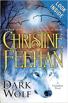
This seems to be a supernatural romance.
Note that this book is a “picture cover” with the hot male chest (the face is cut off. This is common in romance) and the wolf, which indicates to me “paranormal romance.” There’s usually an animal and a half naked man.
I’m not a font maven, so I can’t tell you what the font is, but it is a fancy font for the name, and the name is featured and about three times as large as the title. You can see that name even in thumbnail.
Yes, the author is a bestseller, but frankly, just seeing a name that size, without thinking, the reader will think “bestseller” so there’s no reason for you not to do it. It’s not a conscious thing, it’s beneath the thought process, so you’re not really lying. You’re just conveying the impression that you’re big heap writer and increasing the chances they’ll buy.
Note the “old time” hairstyle, (face again missing) and the font, as well as the author’s name in a golden shape. This is likely a regency (I don’t read much romance, but if the cover isn’t on a regency, they’re signaling wrong.)
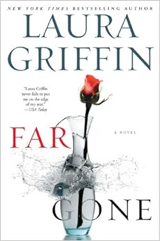
This is a contemporary romance/thriller. Note that it’s still a photo cover. The rose, and the shattering vase indicate romance and danger. Also, the romances with elements of thriller often have these spare minimalist covers. Again, note the author name on top.
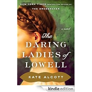
Something I’m noticing looking through these, that even I never saw before, is that everyone says “a novel.” I don’t know if this is now in all fiction — an artifact of the digital age, where “a book” can be a novella or a short story — I shall keep an eye out as we move on.
Now let’s look at mystery. Mystery has a half dozen subgenres, but we’ll look at thriller, police procedurals and cozies. (You can look at the others yourself!)
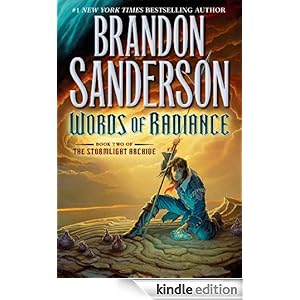
![]() This is a thriller. Note the almost minimalist cover, with the letters center stage. That last romance cover could have worked well for a thriller with a romantic element, as well.
This is a thriller. Note the almost minimalist cover, with the letters center stage. That last romance cover could have worked well for a thriller with a romantic element, as well.
![]()
Police procedural — photo realistic art, stark lettering.
![]()
Cozy — a category that covers things like funny mysteries, Agatha-Christie like mysteries and craft mysteries. These always have “drawn covers” and often no people shown in any detail.
There are other subgenres, including historical. Go look them up. Look at how genre is signaled.
Then there’s science fiction and fantasy. Here you have to filter out the “movie based” (did that in the other sets to) because those tend to be different, and also the “first a bestseller in the seventies” because those covers often retain a touch of nostalgia, to fit with the author’s previous books.
You’ll also have to filter out paranormal romance, which Amazon throws in the same category, and Dean Koontz whose publishers have put him in Romance, Mystery and SF/F. Sigh. Publishers.
Clearly heroic fantasy. The character’s attire, the lettering, everything conveys “medieval” while the diffuse light in the back says “magic.”
![]()
This is urban fantasy, a genre that often skirts the edge of romance, but is not supposed to fall in. Note the tough chick and hints of monstrous being that are par for the course in this subgenre.
![]()
Historic fantasy is a genre now in eclipse, so there is no cover until like the third page, under fantasy. It runs the gamut, from just some kind of symbol on cover, to something evoking the time period. Note, it’s usually “drawn” not photo.
Science fiction has a million subgenres, but a lot of them are heavily influenced by Baen covers, which tend to be “a scene from the novel.”
Note for instance, Dave Weber, with Mil SF
![]()
Note the cover is “drawn, not a photo, again.”

This might not look it, but it’s also a drawn cover, and with the single figure, and stark lettering they’re going for the thumbnail clicks.
Then there is literary — oh, there are a ton of other things in between, but we should cover literary, before this post runs to ten pages.
Literary fiction often has the most beautiful covers, for sheer “oh, that’s artistic.” They also often have sketchy or very artistic lettering. They’re probably the hardest cover to do to convey “literary and important.” If you fall just slightly short you convey “literary and little” and while that’s a niche, it’s not… one that pays a lot.
![]()
Frankly this one is not very impressive, but the novelty of the peekaboo cover atones for some sins.
The problem here is filtering out all the novels that are “literary” in retrospect, though they were initially genre novels — like Farenheit 451 — as well as all the classicals and reprints.
But the next two are pretty good examples of “literary” and what you tend to get when you hire a decent cover designer for your genre book. (If you don’t hire a decent one, it can get much worse.) How worse? Look at last cover posted.
![]()
Note the nice pictures, the artistic, but not necessarily very legible lettering, and the tiny author name. If you’re writing for the Oprah recommendation, this is the way to go. (Of course you also need decent reviews, etc, but it doesn’t hurt to try.)
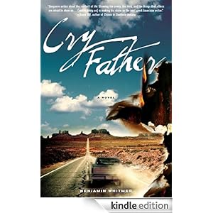
On the other hand, how bad can bad cover design get? Well, this gets linked all over. It’s still pretty awful anyway. So feast your eyes upon it:
![]()
Okay — so last week we’ll look at how to make a book look like a book. I’m not an amazing designer, but even my evolution has been steep enough. (Though I as never as bad as the… thing above.)


Join the conversation as a VIP Member