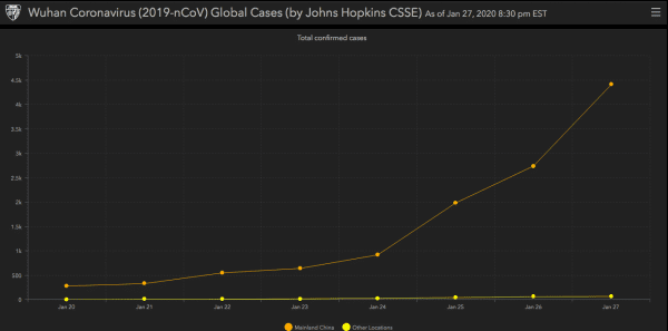
SO A READER POINTS TO THIS GRAPHIC OF CONFIRMED NEW CORONAVIRUS CASES to suggest that the epidemic is already peaking. That would be nice and is earnestly to be hoped for. But although the curve kinda looks like a sigmoid, which would be good, that’s based on one day’s data. Problems with data collection or reporting could account for that, and so could lying by the Chinese government, which is alas not to be ruled out. I hope it’s another SARS-like fizzle, but it’ll be at least a couple of weeks before we can say that with even modest confidence.
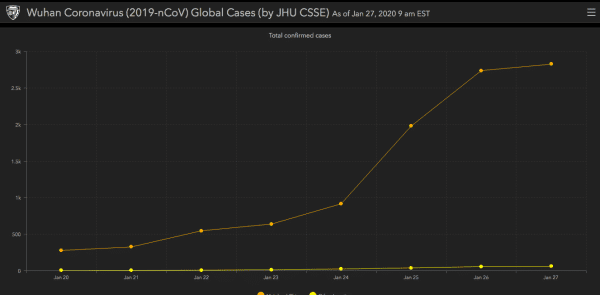
UPDATE: It’s been updated now. Bye, bye, sigmoid.